Bree here, from Home Zone Furniture.
When the leaves begin to fall, you swap out your summer staples for warmer tones and textures. Why not give your home the same consideration you give your wardrobe?
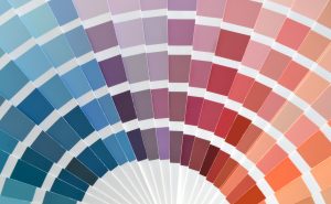
Invite the beauty of the season across your threshold with Pantone’s fall colors. The 2015 fall color wheel honors moments in American history with a particular emphasis on the style of the 1970s. Pantone’s palette is deeply grounded in earthy tones, with a few vibrant pops of color. But it doesn’t matter which of the 10 colors speaks to you most, any of them can be easily blended into your home’s decor regardless of your style.
As for where to put the colors—the possibilities are endless. Given that these colors are rich tones well suited to fall, incorporate them on items you can easily trade out. In other words, if you’re going to do a seasonal décor swap, don’t commit to painting an entire wall.
Choose warm colors and cozy fabrics that complement each other. Change out your couch or chair slipcovers for a heavy fabric like velvet in an inviting color such as Cashmere Rose. If you’re going to change out curtains, a color such as Biscay Bay will maintain the light in the room but add some subtle fall color. Choose a heavy material for the curtains so you can block window drafts once the temperature drops.
Depending on the size of the room, changing the area rug can also be a difference-maker and requires minimal effort. To make decorating the rest of the room a little easier, go with a rug in a neutral, earthy tone so it doesn’t overpower the space with its color.
While these color swaps can make a substantial change in the look and feel of the room, there are other small ways to try out Pantone’s fall colors with less commitment. For example, instead of purchasing an area rug in eye-catching Amethyst Orchid, try the color out on a small item first. It’s less nerve-racking to experiment with color when it’s limited to accent pillows or window box foliage.
As you choose your fall palette from the Pantone wheel, imagine how you’ll transition the colors into and out of the season. After all, fall is only three months long! If you had a lot of vibrant yellow accents in the summer, replacing them with a similar color such as Oak Buff might be easier. Another component to consider is how you’ll move from these fall colors into a winter palette. With the holidays in mind, you might discover that you’ll get the most use out of a timeless, neutral color such as Desert Sage.
So what are you waiting for? Make the most of fall and bring the great outdoors in with the Pantone palette!
Bree


